Graphic Presentation
Learning Objectives
- Create and interpret a frequency table
- Determine when relative frequencies, cumulative frequencies and cumulative percentages are helpful/appropriate and when they are not
- Create and interpret a pie chart, a bar chart and a histogram, and determine which types of data are most appropriate for each
Key Terms
Frequency: the number of times a given observation appears in the data
Frequency distribution: a table reporting the number of observations falling into each category of the variable
Cumulative frequency distribution: a distribution showing the number of observations falling at or below each category,
interval or score of a given variable. It is essentially a running total of frequencies.
Cumulative percent distribution: a distribution showing the percentage of observations falling at or below each category,
interval or score of a given variable.
Overview
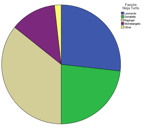
Last spring, I asked all the students in my class to name their favorite Teenage Mutant Ninja Turtle. The results were as follows:
Leonardo = 15
Donatello = 13
Raphael = 20
Michelangelo = 7
Other = 1 (One student put "Galapagos tortoise," either because he didn't understand the
question or because he was being glib.)
The frequency (f) of a particular observation is the number of times the observation occurs in the data. In this example, the frequency of the Leonardo category is 15 because 15 people said he was their favorite. The distribution of a variable is the pattern of frequencies of the observation. A frequency distribution is a table that reports the number of observations that fall into each category of the variable we're analyzing. Making a frequency distribution for my Ninja Turtle data is pretty straightforward:
Favorite Ninja Turtle
| Turtle/Tortoise | Frequency (f) |
| Leonardo | 15 |
| Donatello | 13 |
| Raphael | 20 |
| Michelangelo | 7 |
| Other | 1 |
| Total | 56 |
Frequency distributions can show either the actual number of observations falling in each category or the percentage of observations. The actual number is called the raw score, while a distribution that includes the percentage of observations is called a relative frequency distribution. Relative frequency distributions are referred to as such because they allow for comparison between categories with unequal numbers of observations. We can turn the above table into a relative frequency distribution by calculating the percentage of observations in each category:
Favorite Ninja Turtle
| Turtle/Tortoise | Frequency (f) | Relative Frequency (%) |
| Leonardo | 15 | 15/56 = 0.27 x 100 = 27% |
| Donatello | 13 | 13/56 = 0.23 x 100 = 23% |
| Raphael | 20 | 20/56 = 0.36 x 100 = 36% |
| Michelangelo | 7 | 7/56 = 0.13 x 100 = 13% |
| Other | 1 | 1/56 = 0.02 x 100 = 2% |
| Total | 56 | 56/56 = 1 x 100 = 100% |
Relative frequencies can be useful when comparing the distributions of two different samples. Last fall, I asked my students the same question about their favorite Ninja Turtles, and the results are as follows:
Favorite Ninja Turtle
| Turtle | Frequency (f) |
| Leonardo | 7 |
| Donatello | 13 |
| Raphael | 5 |
| Michelangelo | 15 |
| Total | 40 |
Suppose we wanted to compare the popularity of Donatello between my two classes. We can see from looking at the raw frequencies that 13 of the students in my class last spring listed Donatello as their favorite, and 13 of the students in my class last fall did as well. Can we therefore conclude that Donatello was equally popular in both classes? No! We can't compare raw frequencies directly because the two groups have different sample sizes. My class last spring had 56 students, while my class last fall only had 40. In stats terminology, we would say that n=56 in the first sample, while n=40 in the second. In order to compare the two, we need to calculate the relative frequencies of the second sample:
Favorite Ninja Turtle
| Turtle | Frequency (f) | Relative Frequency (%) |
| Leonardo | 7 | 7/40 = 0.175 x 100 = 17.5% |
| Donatello | 13 | 13/40 = 0.325 x 100 = 32.5% |
| Raphael | 5 | 5/40 = 0.125 x 100 = 12.5% |
| Michelangelo | 15 | 15/40 = 0.375 x 100 = 37.5% |
| Total | 40 | 40/40 = 1 x 100 = 100% |
Even though the same number of students in each class listed Donatello as their favorite Ninja Turtle, a higher percentage (i.e., a greater relative frequency) of students listed him as their favorite in the second sample.
Because "favorite Ninja Turtle" is a nominal variable, it would be just as easy to display these data as a pie chart. This pie chart shows the distribution of "favorite Ninja Turtle" among my class from last spring:
Pie charts are generally best for nominal-level variables, which are not ordered, while bar graphs are generally best for ordinal-level variables, which are ordered. This is because bar graphs allow us to display the categories in order from least to greatest. Consider the following made-up graph of the distribution of students in a fictional class by grade level:
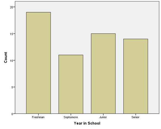
A bar chart allows us to display the frequency of each category while simultaneously keeping the categories in order from lowest to highest. Graphs and charts like these are usually used for nominal or ordinal variables that have relatively few categories. With interval/ratio level variables like GDP that typically have many more categories, there are better ways of summarizing information, which we will begin to talk about in the next chapter. I could make a pie chart illustrating the GDP for all 195 countries on the planet, but it would look pretty messy (it would have 195 slices).
Cumulative Frequencies
With interval/ratio variables, we can take our analysis a little further. The following table represents the annual income data taken from the fourth wave of the National Survey of Adolescent Health (the Add Health dataset).
Annual Income
| Income in USD | Frequency (f) | Percent of Total |
| Less than 5,000 | 134 | 2.84 |
| 5,000 to 8,999 | 117 | 2.48 |
| 9,000 to 13,999 | 172 | 3.64 |
| 14,000 to 18,999 | 167 | 3.54 |
| 19,000 to 23,999 | 234 | 4.96 |
| 24,000 to 28,999 | 269 | 5.70 |
| 29,000 to 38,999 | 498 | 10.55 |
| 39,000 to 48,999 | 570 | 12.07 |
| 49,000 to 73,999 | 1,147 | 24.30 |
| 74,000 to 99,999 | 696 | 14.74 |
| 100,000+ | 717 | 15.17 |
| Total | 4,721 | 100.00 |
This table is very similar to the above examples, but with one important difference. Both "Favorite Ninja Turtle" and "Year in School" have a relatively small number of categories, while income does not. I suppose I could display the information in terms of the nearest whole dollar, but that would probably give me one category for each of the 4,721 respondents, which would make for a comically large—and not terribly informative—table. To solve this problem, I collapsed the data into intervals. These intervals are often known as "class intervals," and are almost always used to summarize interval ratio data. In this case, we could say the width of the class interval is 5,000 (except for some of the larger intervals, which have a width of 10,000 or 24,000). There is no hard-and-fast rule for how wide to make the intervals; it usually falls to the discretion of whoever made the table.
With interval/ratio data, we can add two columns to the above table: cumulative frequency and cumulative percent. Cumulative frequency represents the number of observations that fall at or below a given interval, while cumulative percent represents the percent of observations that fall at or below a given interval. Please note: Including cumulative frequency and cumulative percent in a table only makes sense when dealing with variables that can be ranked from least to greatest. Including cumulative frequency and cumulative percent when describing a nominal-level variable is totally illogical. It's literally asking, "How many people are black or above?" or "How many people are Catholic or below?" Here's an example of a table with a cumulative frequency column:
Annual Income
| Income in USD | Frequency (f) | Percent of Total | Cumulative Frequency |
| Less than 5,000 | 134 | 2.84 | 134 |
| 5,000 to 8,999 | 117 | 2.48 | 251 |
| 9,000 to 13,999 | 172 | 3.64 | 423 |
| 14,000 to 18,999 | 167 | 3.54 | 590 |
| 19,000 to 23,999 | 234 | 4.96 | 824 |
| 24,000 to 28,999 | 269 | 5.70 | 1,093 |
| 29,000 to 38,999 | 498 | 10.55 | 1,591 |
| 39,000 to 48,999 | 570 | 12.07 | 2,161 |
| 49,000 to 73,999 | 1,147 | 24.30 | 3,308 |
| 74,000 to 99,999 | 696 | 14.74 | 4,004 |
| 100,000+ | 717 | 15.17 | 4,721 |
| Total | 4,721 | 100.00 |
To calculate the cumulative frequency for a given interval, we simply add the frequencies of that interval to all the intervals above it. For example, to calculate the cumulative frequency for the 5,000-9,000 interval, I added that interval's frequency (117) to that of all the intervals above it (134). In other words, 134+117 = 251. The same process holds true for any other interval. For the 25,000-29,000 interval, we simply add that interval's frequency (269) to those of all the intervals above it: 269+234+167+172+117+134 = 1,193. We can interpret that number by saying 1,093 of the people in our sample make $29,000 or less per year.
Calculating the cumulative percent follows essentially the same process except we sum the percentages rather than the number of observations. Consider the following table:
Annual Income
| Income in USD | Frequency (f) | Percent of Total | Cumulative Frequency | Cumulative Percent |
| Less than 5,000 | 134 | 2.84 | 134 | 2.84 |
| 5,000 to 8,999 | 117 | 2.48 | 251 | 5.32 |
| 9,000 to 13,999 | 172 | 3.64 | 423 | 8.96 |
| 14,000 to 18,999 | 167 | 3.54 | 590 | 12.50 |
| 19,000 to 23,999 | 234 | 4.96 | 824 | 17.46 |
| 24,000 to 28,999 | 269 | 5.70 | 1,093 | 23.16 |
| 29,000 to 38,999 | 498 | 10.55 | 1,591 | 33.71 |
| 39,000 to 48,999 | 570 | 12.07 | 2,161 | 45.78 |
| 49,000 to 73,999 | 1,147 | 24.30 | 3,308 | 70.08 |
| 74,000 to 99,999 | 696 | 14.74 | 4,004 | 84.82 |
| 100,000+ | 717 | 15.17 | 4,721 | 100.00 |
| Total | 4,721 | 100.00 |
This table contains the same information as the previous tables, but the cumulative percent column allows for easier interpretation. For example, we could say that 23.16 percent of the people in our sample make $29,000 per year or less.
Rather than using bar graphs or pie charts, we can display interval/ratio data as a histogram. Some people (mistakenly) use the terms bar chart and histogram synonymously—they are not the same thing. The main difference between a histogram and a bar chart is this: in the case of the histogram, the distance between the bars (or bins, or buckets—there are a bunch of different names) is meaningful. In the bar graph used to illustrate grade level, for example, the distance between the categories isn't meaningful; in other words, you can't subtract a junior from a senior and get a freshman. In a histogram, however, the distance between intervals is meaningful. Consider the following histogram, which illustrates the distribution of ages from the New Immigrant Survey:
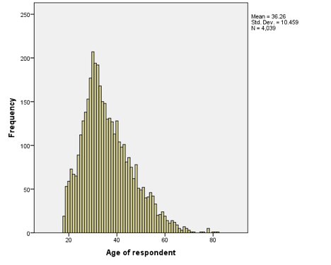
In this case, the distance between intervals is meaningful. Someone who is 60 years old is exactly 20 years older than someone who is 40. In other words, the further away the bars are from one another, the greater the difference between them.
Main Points
Frequency tables, pie charts, bar charts and histograms are all means of summarizing
and displaying data. Determining the best or most appropriate way of displaying data
depends largely on the level of measurement of the variable in question.
Nominal-level variables can be displayed as frequency tables, but you should only
include raw and relative frequencies (cumulative frequency and cumulative percent
are inappropriate for use with nominal-level data). Nominal-level data can also be
displayed as either pie charts or bar charts.
Frequency tables displaying ordinal-level data can include raw frequencies, relative
frequencies, cumulative frequencies and cumulative percentages. Like nominal-level
data, ordinal-level data can be summarized with either pie charts or bar charts, though
bar charts are arguably more effective.
Frequency tables containing interval/ratio-level data can include all of the same
components as those containing ordinal-level data, though they often include class
intervals in order to make them easier to interpret. Interval/ratio-level data are
the only data for which histograms are appropriate.
Tables, Charts and Graphs in SPSS
Before we start, there's one more thing about SPSS that I would like you to keep in mind. SPSS gives you a lot of options. SPSS gives you so many options, in fact, that even relatively simple procedures are needlessly complicated by superfluous buttons, drop-down menus and tabs. As you work through this section (and the manual in general), I would encourage you to ignore everything that isn't specifically included in the instructions.
Begin by downloading and opening the Add Health dataset. To create a frequency table, simply click on "Analyze," then "Descriptive Statistics," and then "Frequencies." Select the variable for which you would like to create a frequency table, and then move it into the (currently empty) "Variables" box by clicking on the arrow pointing to the right. Now click "Okay." The "Output" window should now pop up to display your frequency table. If you chose to make a frequency table for an interval/ratio variable, your table is probably several pages long, a fact that may lead you to (correctly) suspect that there must be better ways of summarizing interval/ratio data. We'll tackle that issue in the next chapter.
To create any sort of a graph (pie chart, bar graph or histogram), you'll need to click on "Graphs" and select "Legacy Dialogs" from the drop-down menu. You may be tempted to select "Chart Builder," but try to ignore it for now. The pop-out menu under "Legacy Dialogs" offers several different options in terms of graph creation, but we will focus on pie charts, bar charts and histograms.
First, let's make a pie chart. Under "Legacy Dialogs" select "Pie." A dialog box will open, giving you a choice between "Summaries for Groups of Cases," "Summaries of Separate Variables," and "Values of Individual Cases." Select the first option and click "Define." In the next dialog box, choose the variable you would like to see plotted in the pie chart, and move it into the space labeled "Define Slices by." Now click "Okay." A pie chart of the variable you chose should appear in your output window. If at any point you decide your chart doesn't quite look right, you can double click on the chart itself to open the chart editor. The chart editor allows you to change the colors of your charts, add backgrounds and add/remove labels. If you have a minute, I recommend playing around with it.
Now we'll make a bar graph. Under "Legacy Dialogs" select "Bar." Select "Simple" if you wish to have bars or lines of only one color displayed on the graph, in which case each bar or line will represent the relative frequency of the others. Choosing "Clustered" and "Stacked" will divide one variable into subgroups based on the level of a second variable (i.e., comparing different levels of educational attainment by race). Again, choose "Summaries for Groups of Cases" and click okay. Choose the variable you would like to see plotted on a bar graph and move it into the box labeled "Category Axis." If you chose to make either a clustered or stacked bar graph, you will also need to place a variable in the box labeled either "Display Clusters by" or "Display Stacks by." Once all the variables are in place, click "Okay" and a bar graph will appear in your output window.
Finally, let's make a histogram. Under "Legacy Dialogs" select "Histogram." Choose the variable you would like to see displayed in the histogram, and move it to the box labeled "Variable." Remember, histograms are only used with interval/ratio (a.k.a. "scale") variables, so choose your variable accordingly. Click "Okay," and a histogram should appear in your output window. Please enjoy this video walkthrough:
Exercises
- Using the ADD Health dataset, create a pie chart for the "RACE" variable. Double click on your chart, and use the chart editor to change the colors of the slices and/or background.
- Create a frequency table for "GENDER." Approximately what percent of the respondents are female? Note that SPSS automatically displays a "Cumulative Percent" column. Does that make sense with a variable like "GENDER?" Hint: think of the level of measurement (nominal, ordinal or interval/ratio).
- Choose your favorite ordinal-level variable and make both a pie chart and a simple bar graph. Which do you think is easier to interpret? Are there any advantages to using one over the other?
- Create a clustered bar graph that shows "TVTIME" divided into groups by "RACE." In other words, create a clustered bar graph in which you place "TVTIME" in the "Category Axis" box and "RACE" in the "Display clusters by" box. Now interpret the graph. Do there appear to be any differences in the amount of time spent watching TV per day across racial groups?
- Finally, using the NIS dataset, create a histogram of the "AGE" variable. Which age(s) appear to have the highest frequency(ies)?