Ordinary Least Squares (OLS) Regression
Learning Objectives
- Understand the concept of a linear relationship between two variables
- Understand the concept of a "best-fitting line" in the context of OLS regression
- Calculate and interpret the slope and y-intercept
- Calculate and interpret r2 and r
Key Terms
Linear relationship: a relationship between two interval/ratio variables is said to be linear if the observations,
when displayed in a scatterplot, can be approximated by a straight line. In other
words, if we were to play connect-the-dots, the result would be a straight line.
Ordinary least squares (OLS) regression: a technique in which a straight line is used to estimate the relationship between
two interval/ratio variables. The line that minimizes the sum of the squared errors
(the distance between the line and each observation) is said to be the "best-fitting
line."
Y-intercept (a): the point at which the regression line crosses the y-axis. Alternatively, the y-intercept
can be thought of as the value of y when x is zero.
Slope (b): the amount of change in y (the dependent variable) for each unit-change in x (the
independent variable), or rise/run, for those of you who actually remember 8th grade
algebra.
Overview
We can use bivariate regression to look at the relationship between any two variables, but for the purposes of this course we will focus on interval/ratio variables. Bivariate regression tells us the amount of change in the dependent variable for each unit change in the independent variable. In other words, we can tell exactly how much someone's income goes up for each year of school he or she has completed. At this point, we're no longer talking about relationships in terms of "strong" and "weak" like we did with nominal and ordinal measures of association (if your instructor skipped nominal and ordinal measures of association, just smile and nod). We can now calculate the exact relationship between the two variables.
The first step in calculating bivariate regression is to make a scatterplot, like so:
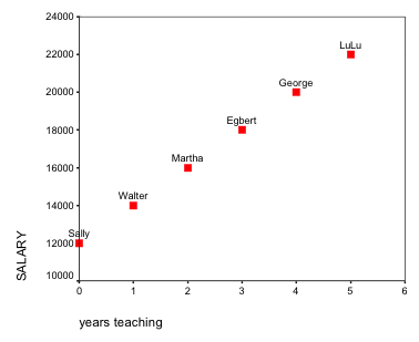
Here we have a very basic scatterplot detailing the relationship between one's years of experience as a teacher and one's salary. The independent variable (years teaching) always goes along the bottom, or x-axis.
Notice that Sally, who just started teaching, has a salary of $12,000. This starting point is also known as the y-intercept. It is referred to the y-intercept because it is the point at which the regression line crosses the y-axis.
This scatterplot shows a linear relationship between the two variables. A linear relationship is a relationship between two interval/ratio variables in which the observations displayed in a scatterplot can be approximated by a straight line. In other words, if we were to play connect-the-dots, the result would basically be a straight line. This scatterplot is an example of a perfect linear relationship, meaning that all the dots fall exactly along a straight line. We almost never see perfect linear relationships in the social sciences.
A scatterplot is useful for three reasons:
- It tells us whether or not we have a linear relationship (FYI—this type of regression only works with linear relationships. If your scatterplot came out looking like a giant frowny face, you'd have to use a different kind of regression.)
- It tells us the directionality of our relationship (positive or negative)
- It makes us aware of any outliers in our data (observations that deviate significantly from the rest of our data)
Now suppose we wanted to predict the salary of someone with six years of teaching experience. We can predict any score on the dependent variable with the following equation:
![]()
ŷ = the predicted value
x = the actual score on the dependent variable
a = the y-intercept, or the point where the line crosses the y-axis; therefore a is the value of y when x is 0
b = the slope of the regression line, or the change in y with each unit change in x. In our example, a = 12,000 and b = 2,000. A teacher will make $12,000 with zero years of experience, but his or her salary will go up by $2,000 with each year of experience. For a more detailed explanation of how to find b, see either your textbook or the examples posted on Canvas.
Because perfectly linear relationships are extremely rare in the real world, any actual scatterplots you put together will probably look something like this:
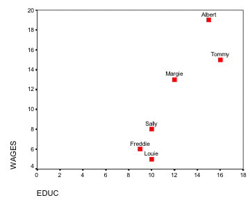
We can see that this relationship is linear, but how do we draw a line that will accurately depict the relationship between education and income? Few if any of our values are likely to fall directly on the line, and some may fall a great distance from it. Generally speaking, the best-fitting line is the one that generates the least amount of error, or the one that minimizes the distance between the line and our observations.
r2 and r
Not all best fitting lines are created equal; some might not be representative of our data at all. We need a statistic that can tell us, among other things, how well our line fits our data. The coefficient of determination, or r2, does just that. The formula for calculating r2 is as follows:

Or, put a bit more simply, we square the covariance—a measure of the degree to which two variables are linearly associated with one another—and divide it by the product of the variance of each of our variables.
In the example from the previous set of notes, which can be found in the "Files" section on Canvas, the covariance is 46.8, and the variance of x and y are 6.5 and 355.5, respectively. Thus, to find r2 we need only plug our values into the formula:
(46.8)2/(6.5)(355.5) = .946
r2 tells us three things:
- Goodness of fit (i.e. the distance between the best-fitting line and the various dots on our scatterplot). This is a measure of the amount of error in our best fitting line.
- The amount of variance in the dependent variable that's accounted for by the independent variable.
- Since r2 is a PRE measure, it tells us the extent to which knowing the independent variable reduces our error in predicting the dependent variable. PRE measures are discussed further below.
A couple of important things about r2:
- r2 ranges from zero to one. In other words, it is always positive. If you get an r2 value that's negative (or greater than one, for that matter), you might want to check your math again.
- The closer r2 is to 1, the better the line fits our data.
Another commonly used measure of association between interval/ratio variables is r, also known as Pearson's Correlation Coefficient. To find r, we just take the square root of r2, like so:
![]()
A few things to remember about r:
r can be either positive or negative and ranges from -1 to 1
r should always have the same sign as the covariance. If your covariance is negative,
r should also be negative
r is useful because it returns our measure of association to the original metric
We can also calculate r by dividing the covariance by the product of the standard
deviations of each of our variables:
r = [covariance of (X,Y)]/[standard deviation (X)][standard deviation(y)]
Taking the square root of r2 is easier, don't you think?
Main Points
A scatter plot is a quick, easy way of displaying the relationship between two interval/ratio
variables
Ordinary least squares (OLS) regression is a process in which a straight line is used
to estimate the relationship between two interval/ratio level variables. The "best-fitting
line" is the line that minimizes the sum of the squared errors (hence the inclusion
of "least squares" in the name).
r2 and r indicate the strength of the relationship between two variables as well as
how well a given line fits its data
OLS regression in SPSS
To calculate a regression equation in SPSS, click Analyze, Regression, and then Linear. From here, you just need to put one variable in the "Independent" space and one variable in the "Dependent" space. Click OK.
The results of your regression equation should appear in the output window. SPSS displays the results in a series of several tables, but we're only interested in two of them: the "Model Summary" table and the "Coefficients" table. The model summary table displays the r and r2 values, both of which are indicative of how well your line fits your data. The coefficients table is where you will find your slope and y-intercept. For a more detailed breakdown of this regression output, see the accompanying video:
Exercises
- Using the New Immigrant Survey data, calculate the slope and y-intercept for the effect of education (IV) on income (DV). Write the equation in the format y = bx + a. Use the equation to predict the income of someone with 12 years of education.
- Using the same data, calculate the slope and y-intercept for the effect of age on income. Report and interpret the r and r2 values. In other words, how well does the line fit the data?