Central Tendency & Variability
Learning Objectives
- Understand and calculate three ways that the center of a distribution can be defined
- Understand and calculate four ways the amount of dispersion or variability in a distribution can be determined
- Understand how skew and level of measurement can help determine which measures of central tendency and variability are most appropriate for a given distribution
Key Terms
Measures of central tendency: categories or scores that describe what is "average" or "typical" of a given distribution.
These include the mode, median and mean.
Percentile: a score below which a specific percentage of a given distribution falls.
Positively skewed distribution: a distribution with a handful of extremely large values.
Negatively skewed distribution: a distribution with a handful of extremely low values.
Measures of variability: numbers that describe the diversity or dispersion in the distribution of a given
variable.
Box plot: a graphic representation of the range, interquartile range and median of a given
variable.
The Mode
The mode is the category with the greatest frequency (or percentage). It is not the frequency itself. In other words, if someone asks you for the mode of the distribution shown below, the answer would be coconut, NOT 22. It is possible to have more than one mode in a distribution. Such distributions are considered bimodal (if there are two modes) or multi-modal (if there are more than two modes). Distributions without a clear mode are said to be uniform. The mode is not particularly useful, but it is the only measure of central tendency we can use with nominal variables. You will find out why it is the only appropriate measure for nominal variables as we learn about the median and mean next.
Favorite Flavors of Ice Cream:
Coconut = 22
Chocolate = 15
Vanilla = 7
Strawberry = 9
The Median
The median is the middlemost number. In other words, it's the number that divides the distribution exactly in half such that half the cases are above the median, and half are below. It's also known as the 50th percentile, and it can be calculated for ordinal and interval/ratio variables. Conceptually, finding the median is fairly simple and entails only putting all of your observations in order from least to greatest and then finding whichever number falls in the middle. Note that finding the median requires first ordering all of the observations from least to greatest. This is why the median is not an appropriate measure of central tendency for nominal variables, as nominal variables have no inherent order. (In practice, finding the median can be a bit more involved, especially if you have a large number of observations—see your textbook for an explanation of how to find the median in such situations).
Some of you are probably already wondering, "What happens if you have an even number of cases? There won't be a middle number then, right?" That's a very astute observation, and I'm glad you asked. If your dataset has an even number of cases, the median is the average of the two middlemost numbers. For example, for the numbers 18, 14, 12, 8, 6 and 4, the median is 10 (12 + 8 = 20; 20/2 = 10).
One of the median's advantages is that it is not sensitive to outliers. An outlier is an observation that lies an abnormal distance from other values in a sample. Observations that are significantly larger or smaller than the others in a sample can impact some statistical measures in such a way as to make them highly misleading, but the median is immune to them. In other words, it doesn't matter if the biggest number is 20 or 20,000; it still only counts as one number. Consider the following:
Distribution 1: 1, 3, 5, 7, 20
Distribution 2: 1, 3, 5, 7, 20,000
These two distributions have identical medians even though Distribution 2 has a very large outlier, which would end up skewing the mean pretty significantly, as we'll see in just a moment.
The Mean
The mean is what people typically refer to as "the average". It is the highest measure of central tendency, by which I mean it is available for use only with interval/ratio variables. The mean takes into account the value of every observation and thus provides the most information of any measure of central tendency. Unlike the median, however, the mean is sensitive to outliers. In other words, one extraordinarily high (or low) value in your dataset can dramatically raise (or lower) the mean. The mean, often shown as an x or a y variable with a line over it (pronounced either "x-bar" or "y-bar"), is the sum of all the scores divided by the total number of scores. In statistical notation, we would write it out as follows:


In that equation, is the mean, X represents the value of each case and N is the total number of cases. The sigma (Σ) is just telling us to add all the scores together. The fact that calculating the mean requires addition and division is the very reason it can't be used with either nominal or ordinal variables. We can't calculate a mean for race (white + white + black/3 = ?) any more than we can calculate a mean for year in school (freshman + freshman + senior/3 = ?)
Percentiles
A percentile is a number below which a certain percent of the distribution falls. For example, if you score in the 90th percentile on a test, 90 percent of the students who took the test scored below you. If you score in the 72nd percentile on a test, 72 percent of the students who took the test scored below you. If scored in the 5th percentile on a test, maybe that subject isn't for you. The median, you recall, falls at the 50th percentile. Fifty percent of the observations fall below it.
Symmetrical vs. Skewed Distributions
A symmetrical distribution is a distribution where the mean, median and mode are the same. A skewed distribution, on the other hand, is a distribution with extreme values on one side or the other that force the median away from the mean in one direction or the other. If the mean is greater than the median, the distribution is said to be positively skewed. In other words, there is an extremely large value that is "pulling" the mean toward the upper end of the distribution. If the mean is smaller than the median, the distribution is said to be negatively skewed. In other words, there is an extremely small value that is "pulling" the mean toward the lower end of the distribution. Distributions of income are usually positively skewed thanks to the small number of people who make ungodly amounts of money. Consider the (admittedly dated) case of Major League Soccer players as an extreme example. The mean annual salary for an MLS player in 2010 was approximately $138,000, but the median annual salary was only about $53,000. The mean was almost three times larger than the median, thanks in no small part to David Beckham's then $12 million salary.
When trying to decide which measure of central tendency to use, you must consider both level of measurement and skew. This is not so much the case for nominal and ordinal variables. If the variable is nominal, obviously the mode is the only measure of central tendency to use. If the variable is ordinal, the median is probably your best bet because it provides more information about the sample than the mode does. But if the variable is interval/ratio, you'll need to determine if the distribution is symmetrical or skewed. If the distribution is symmetrical, the mean is the best measure of central tendency. If the distribution is skewed either positively or negatively, the median is more accurate. As an example of why the mean might not be the best measure of central tendency for a skewed distribution, consider the following passage from Charles Wheelan's Naked Statistics: Stripping the Dread from the Data (2013):
"The mean, or average, turns out to have some problems, namely, that it is prone to distortion by "outliers," which are observations that lie farther from the center. To get your mind around this concept, imagine that ten guys are sitting on bar stools in a middle-class drinking establishment in Seattle; each of these guys earns $35,000 a year, which makes the mean annual income for the group $35,000 . Bill Gates walks into the bar with a talking parrot perched on his shoulder. (The parrot has nothing to do with the example, but it kind of spices things up.) Let's assume for the sake of the example that Bill Gates has an annual income of $1 billion. When Bill sits down on the eleventh bar stool, the mean annual income for the bar patrons rises to about $91 million. Obviously none of the original ten drinkers is any richer (though it might be reasonable to expect Bill Gates to buy a round or two). If I were to describe the patrons of this bar as having an average annual income of $91 million, the statement would be both statistically correct and grossly misleading [Note: the median would remain unchanged]. This isn't a bar where multimillionaires hang out; it's a bar where a bunch of guys with relatively low incomes happen to be sitting next to Bill Gates and his talking parrot."
Measures of Variability
In addition to figuring out the measures of central tendency, we may need to summarize the amount of variability we have in our distribution. In other words, we need to determine if the observations tend to cluster together or if they tend to be spread out. Consider the following example:
Sample 1: {0, 0, 0, 0, 25}
Sample 2: {5, 5, 5, 5, 5}
Both of these samples have identical means (5) and an identical number of observations (n = 5), but the amount of variation between the two samples differs considerably. Sample 2 has no variability (all scores are exactly the same), whereas Sample 1 has relatively more (one case varies substantially from the other four). In this course, we will be going over four measures of variability: the range, the inter-quartile range (IQR), the variance and the standard deviation.
The Range
The range is the difference between the highest and lowest scores in a data set and is the simplest measure of spread. We calculate range by subtracting the smallest value from the largest value. As an example, let us consider the following data set:
|
23
|
56
|
45
|
65
|
69
|
55
|
62
|
54
|
85
|
25
|
The maximum value is 85 and the minimum value is 23. This gives us a range of 62 (85 – 23 = 62). Whilst using the range as a measure of variability doesn't tell us much, it does give us some information about how far apart the lowest and highest scores are.
Quartiles and the Interquartile Range
"Quartile" is yet another word that stats geeks use to make themselves feel important. It basically means "quarter" or "fourth." A football game has four quartiles, as does a king-size Twix. Finding the quartiles of a distribution is as simple as breaking it up into fourths. Each fourth contains 25 percent of the total number of observations.
Quartiles divide a rank-ordered data set into four equal parts. The values that divide each part are called the first, second, and third quartiles; and they are denoted by Q1, Q2, and Q3, respectively.
Q1 is the "middle" value in the first half of the rank-ordered data set.
Q2 is the median value of the data set
Q3 is the "middle" value of the second half of the rank-ordered data set
Q4 would technically be the largest value in the dataset, but we ignore it when calculating
the IQR (we already dealt with it when we calculated the range).
Thus, the interquartile range is equal to Q3 minus Q1 (or the 75th percentile minus the 25th percentile, if you prefer to think of it that way). As an example, consider the following numbers: 1, 3, 4, 5, 5, 6, 7, 11. Q1 is the middle value in the first half of the data set. Since there are an even number of data points in the first half of the data set, the middle value is the average of the two middle values; that is, Q1 = (3 + 4)/2 or Q1 = 3.5. Q3 is the middle value in the second half of the data set. Again, since the second half of the data set has an even number of observations, the middle value is the average of the two middle values; that is, Q3 = (6 + 7)/2 or Q3 = 6.5. The interquartile range is Q3 minus Q1, so the IQR = 6.5 - 3.5 = 3.
Boxplots
A box plot (also known as a box and whisker plot) splits the dataset into quartiles. The body of the boxplot consists of a "box" (hence, the name), which goes from the first quartile (Q1) to the third quartile (Q3). Within the box, a horizontal line is drawn at Q2, which denotes the median of the data set. Two vertical lines, known as whiskers, extend from the top and bottom of the box. The bottom whisker goes from Q1 to the smallest value in the data set, and the top whisker goes from Q3 to the largest value. Below is an example of a positively skewed box plot with the various components labeled.
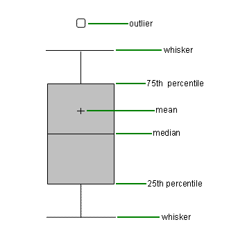

Outliers are values are extreme values that for one reason or another are excluded from the dataset. If the data set includes one or more outliers, they are plotted separately as points on the chart. The above diagram has a few outliers at the bottom.
How to Interpret a Box Plot
The horizontal line that runs across the center of the box indicates where the median falls. Additionally, boxplots display two common measures of the variability or spread in a data set: the range and the IQR. If you are interested in the spread of all the data, it is represented on a boxplot by the vertical distance between the smallest value and the largest value, including any outliers. The middle half of a data set falls within the interquartile range. In a boxplot, the interquartile range is represented by the width of the box (Q3 minus Q1).
The Variance
The variance is a measure of variability that represents on how far each observation falls from the mean of the distribution. For this example, we'll be using the following five numbers, which represent my total monthly comic book purchases over the last five months:
2, 3, 5, 6, 9
The formula for calculating a variance is usually written out like this:


This equation looks intimidating, but it's not that bad once you break it down into its component parts. S2x is the notation used to denote the variance of a sample. That giant sigma (Σ) is a summation sign; it just means we're going to be adding things together. The x represents each of our observations, and the x with a line over it (often called "x-bar") represents the mean of our distribution. The capital "N" on the bottom is the total number of observations. Basically, this formula is telling us to subtract the mean from each of our observations, square the difference, add them all together and divide by N-1. Let's do an example using the above numbers.
1. The first step in calculating the variance is finding the mean of the distribution. In this case, the mean is 5 (2+3+5+6+9 = 25; 25/5 = 5).
2. The second step is to subtract the mean (5) from each of the observations:
2-5 = -3
3-5 = -2
5-5 = 0
6-5 = 1
9-5 = 4
Please note: we can check our work after this step by adding all of our values together. If they sum to zero, we know we're on the right track. If they add up to something besides zero, we should probably check our math again (-3+-2+0+1+4 = 0, we're golden).
3. Third, we square each of those answers to get rid of the negative numbers:
(-3)2 = 9
(-2)2 = 4
(0)2 = 0
(1)2 = 1
(4)2 = 16
4. Fourth, we add them all together:
9+4+0+1+16=30
5. Finally, we divide by N-1 (the total number of observations is 5, so 5-1=4)
30/4 = 7.5
After all those rather tedious calculations, we're left with a single number that quickly and succinctly summarizes the amount of variability in our distribution. The bigger the number, the more variability we have in our distribution. Please note: a variance can never be negative. If you come up with a variance that's less than zero, you've done something wrong.
The Standard Deviation
There is, however, one limitation to using the variance as our only measure of variability. When we square the numbers to get rid of the negatives (step 3), we also inadvertently square our unit of measurement. In other words, if we were talking about miles, we accidentally turned our unit of measurement into miles squared. If we were talking about comic books, we accidentally turned our unit of measurement into comic books squared (which, needless to say, doesn't always make a lot of sense). In order to solve that problem, we calculate the standard deviation. The formula for the standard deviation looks like this:


In other words, calculating the standard deviation is as simple as taking the square root of the variance, reversing the squaring we did in the calculation of the variance. In our example, the standard deviation is equal to the square root of 7.5, or 2.74. The interpretation doesn't change; a large standard deviation is indicative of greater variability, whereas a small standard deviation is indicative of a relatively small amount of variability. As is the case with the variance, the standard deviation is always positive.
Remember: the key difference between the variance and the standard deviation is the unit of measurement. We calculate the standard deviation in order to put our variable back into its original metric. "Miles squared" goes back to being just miles, and "comic books squared" goes back to being just comic books.
Main Points
- Measures of central tendency tell us what is common or typical about our variable.
- Three measures of central tendency are the mode, the median and the mean.
- The mode is used almost exclusively with nominal-level data, as it is the only measure of central tendency available for such variables. The median is used with ordinal-level data or when an interval/ratio-level variable is skewed (think of the Bill Gates example). The mean can only be used with interval/ratio level data.
- Measures of variability are numbers that describe how much variation or diversity there is in a distribution.
- Four measures of variability are the range (the difference between the larges and smallest observations), the interquartile range (the difference between the 75th and 25th percentiles) the variance and the standard deviation.
- The variance and standard deviation are two closely related measures of variability for interval/ratio-level variables that increase or decrease depending on how closely the observations are clustered around the mean.
- Measures of Central Tendency and Variability in SPSS
To have SPSS calculate measures of central tendency and variability for you, click "Analyze," "Descriptive Statistics," then "Frequencies." Measures of central tendency and variability can also be calculated by clicking on either "Descriptives" or "Explore," but "Frequencies" gives you more control and has the most helpful options to choose from. The dialog box that opens should be pretty familiar to you by now. As you did when calculating frequency tables, move the variables for which you would like to calculate measures of central tendency and variability into the right side of the box. You can uncheck the box marked "Display frequency tables" if you'd rather not see any tables and would prefer to see only the statistics. Then click the button on the right labeled "Statistics." From the Dialog box that opens you may select as many statistics as you would like (Note: SPSS uses the term "Dispersion" rather than "Variability," but the two words are synonymous). Also, please be aware that SPSS will calculate statistics for any variable regardless of level of measurement. It will, for example, calculate a mean for race or gender even though that makes no sense whatsoever. Male + male + female/3 = 0.66? Totally illogical. This is one of the many circumstances in which you will have to be smarter than the data analysis package you are using. Just because SPSS will let you do something doesn't necessarily mean it's a good idea.
When calculating measures of variability, it is sometimes helpful to include a box plot. To do so, click on "Graphs," then "Legacy Dialogs" and select "Box Plot." As was the case with the graphs you created in the previous chapter, you'll have several options from which to choose. Generally speaking, you'll want one boxplot for each variable, so choose "Summaries of Separate Variables." Move the variables that you would like to see displayed as box plots to the empty box on the right and click OK. Should you desire to edit your boxplots, you can do so in much the same way you did the graphs in Chapter 2. Here's a video walkthrough:
Exercises
- Choose three variables from any of the three datasets (one nominal, one ordinal and one interval/ratio) and calculate all appropriate measures of central tendency for each.
- Using the ADD Health Dataset, NIS Dataset and the World Values Survey, calculate the standard deviation, variance and range for the "AGE" variable in each. Which survey has the greatest variation in age? Which survey has the least variation in age? (Note: this will require you to open a dataset, calculate the measures of variability, and then open the next dataset. The results from each will remain in your "Output" window regardless of which dataset you have open at a given moment).
- Choose any interval ratio variable and use it to create a box plot. Now interpret the box plot. What are the approximate range, IQR and median of this variable?